
College Scorecard Analysis - Part 1
Introduction
The U.S. Department of Education provides the College Scorecards Dataset to prospective students and their families to inform them about the educational outcomes and costs of attending various federally funded colleges and universities. The purpose of the data is to facilitate the process of making decisions about which college or university to attend based on several performance indicators, student success measures, and fees related to the school. The data used to create reports on the College Scorecard website are a subset of the data universities and colleges report to the Integrated Postsecondary Education Data System (IPEDS).
There are 38,068 rows (observations) in the dataset, representing each college during 5 academic years 2012-2016, inclusive (e.g. Benedict College is featured 5 times, once for each year 2012- 16, inclusive). For year 2012, 7793 colleges were recorded; for year 2013, 7804 colleges were recorded; for year 2014, 7703 colleges were recorded; for year 2015, 7593 colleges are recorded; and for year 2016, 7175 colleges were recorded. The dataset also features 142 columns (variables) such as the name of the university, the location, various SAT/ACT score metrics, etc. that get populated with respective values about each college.
In the dataset, disregarding academic year, the 5 states with the most colleges are California with 3881 colleges, Texas with 2381 colleges, New York with 2317 colleges, Florida with 2176 colleges, and Pennsylvania with 2022 colleges. Similarly, disregarding academic year, the 5 states/territories with the fewest colleges are American Samoa with 5 colleges, Federated States of Micronesia with 5 colleges, Marshall Islands with 5 colleges, Northern Mariana Islands with 5 colleges, and Palau with 5 colleges. When I did this calculation by taking the average amount of colleges per year across the dataset, I got the same results. I also got the same results when I only looked at the most recent year.
I hypothesize that the top 5 states match the top 5 states by population, and similarly the bottom 5 states/territories match the bottom 5 states/territories by population. My hypothesis largely matches reality, with 4 out of 5 most populous states also being in the top 5 by college count (Pennsylvania is the exception). The least populated regions in the US are territories, so my hypothesis is supported as well.
Average Net Price vs Median Earnings 10 Years After Entry
I calculated both of these ranges by finding the minimum and maximum values of each of column separately, and removing all “NA” values. I graphed the values by removing all rows that had “NA” values in either Average Net Price or Median Earnings 10 Years After Entry or both. It’s important to note that the calculated ranges may be broader than what is shown on the graph because the graph excludes more rows than the ranges do.
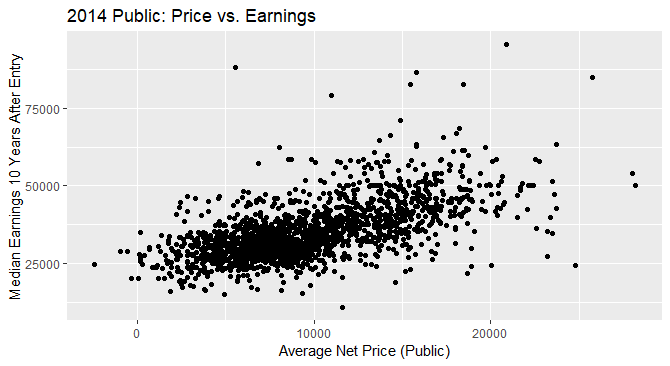
For public schools in the 2014 academic year (see below), there appears to be a pattern between the average net price of the school and the median earnings 10 years after entry. There appears to be a slight upward trend in the plot, or in other words, a positive correlation. Although we cannot be sure that higher prices caused students in those colleges to have higher earnings, we can say that future students should be aware of the relationship because there may be a causal effect. The data is mostly clustered together, with a few outliers, meaning that most students tend to have salaries similar to those of their peers. The range of the average net price is from $-2,434 to $28,201 (the negative values could be errors, or a result of financial aid). The range of median earnings 10 years after entry is $10,800 to $95,600.
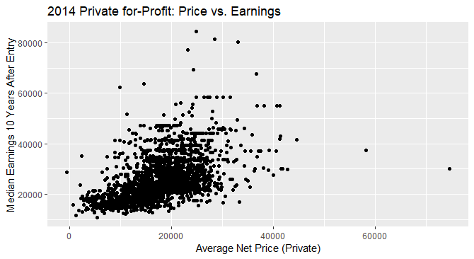
For private for-Profit schools in the 2014 academic year (see below), there also appears to be a pattern between the average net price of the school and the median earnings 10 years after entry. The range of the average net price is from $-581 to $74,673 (the negative values could be errors, or a result of financial aid). While the lower bound for the average net price of private for-profit schools was slightly higher than that of public schools, the upper bound was over 2 times higher than that of public schools. The range of median earnings 10 years after entry is $10,800 to $84,400. This range has the same lower bound as the range for public schools, but the upper bound is $11,200 less than that of public schools. The trend also appears to be upward, slightly more so than the pattern for public schools. Although we cannot be sure that higher prices caused students in those colleges to have higher earnings, we can say that future students should be aware of the relationship because there may be a causal effect. Just like for public schools, the data is mostly clustered together, with a few outliers, meaning that most students tend to have salaries similar to those of their peers.
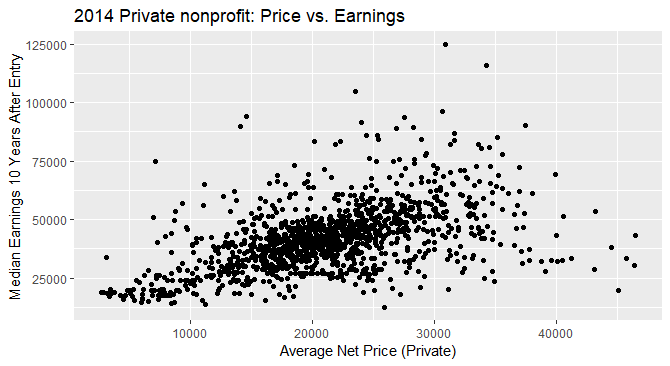
For private nonprofit schools in the 2014 academic year, there also appears to be a pattern between the average net price of the school and the median earnings 10 years after entry. The range of the average net price is from $2,658 to $46,509. While the lower bound for the average net price of private nonprofit schools was slightly higher than that of public and for-profit schools, the upper bound struck a place in the middle of the other 2 types of colleges. The range of median earnings 10 years after entry is $12,500 to $124,700. This range has a higher lower bound as the range for public and private for profit schools, and the upper bound is significantly higher that of public and private for profit schools. The trend in the data also appears to be upward, slightly more so than the pattern for public schools.
Overall, in all cases there seems to be a positive correlation between the average net price and the median earnings 10 years after entry, although the range of values on the x-axis is much broader for private colleges than for public. Students considering applying to these schools should be wary of mistaking correlation for causation, when considering these graphs. From our plots, we cannot be sure that there is a causal relationship between the price and average earnings of any schools. Another implication for students is that they should prepare to pay more money for private schools than for public schools. This may be offset by the average higher earnings that students from private schools earn on average than public schools. All in all, these graphs serve as a jumping off point for further research because a student can’t make prudent decisions based only on 3 graphs.
Note: In the analysis of plots and ranges for Public, Private For-Profit, and Private Nonprofit colleges, I excluded all rows of data that had missing values in any of the following: Median earnings after 10 years, Average net price Public, Average net price Private. I did this at the cost of potentially excluding valuable data, but for the reason of staying as sure and conservative as possible with plots, assumptions, and insights.
College Counts Analysis
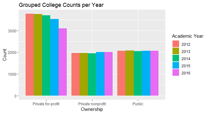
From the plot, it looks like Private for-profit colleges are decreasing in number. This could be true, or perhaps less private for-profit colleges are receiving federal financial aid. The drop is rather steep in years 2014-2016, where the number went from just over 3500 to just over 3000. There also is a slight general increase in the number of private nonprofit and public colleges Again, this could be because more such colleges are receiving federal financial aid, or because they are actually increasing in number. Despite the increase, the number of each type of college is right around 2000 for each year.
UC Davis Admission Rate and Implications
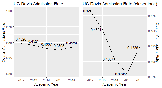
While there is a definite dip in the admissions rate in 2015, it is not as exaggerated as the default axis settings in ggplot2 make it appear. The y axis on the graph on the left ranges from 0 to 1, keeping the scale and proportion of relative changes in the Overall Admissions Rate closer to reality than the graph on the right. Even though it may be helpful to zoom in on the datapoints for the sake of clarity, there exists a danger of inappropriately exaggerating the changes. Another danger with the plot on the right is that, visually, the Admissions Rate appears much different from what the numbers say (e.g. in 2012 it looks like the Admissions Rate was nearly 100%!). The implication for potential applicants to UC Davis may be that they may think the Admissions Rate is more volatile than it really is. Another possible implication is that they grow too confident in their chances of getting in because they judge the increase in the Admissions rate from 2015 to 2016 to be much higher than it really is.
In addition to being aware of the dangers of misaligning data, it’s also important to discuss the dip in the admissions rate in 2015. In order to provide broader context, we could look into other colleges (public, CA, only UC, etc.) to see if there is also a dip in their admissions rate. This would bring us closer to the reason for the dip. We could also look into the cost of attendance of these schools for the years 2012 to 2016 to see if there is a spike in costs in 2015. This is beyond the scope of this report, but something that would useful to look into to gain some broader context.
Data Types
There are few limits to how one can represent statistical data types in R; but there are general guidelines that if followed will result in a smooth-flowing work experience. Statistical data are divided into two types: categorical and numerical, and each type is subdivided into nominal and ordinal for categorical data and discrete and continuous for numerical data. Nominal data is categorical data that doesn’t imply a rank order (e.g. male, female; name of school attended). Ordinal data is categorical data that implies a rank order (e.g. highest level of education). Discrete data is numerical data that has values that can’t be subdivided (e.g. place of finishing a marathon; age in years). Continuous data is numerical data that can be subdivided and doesn’t have any preset values (e.g. height, dimensions of furniture). (Source)
For each statistical data type, there are numerous ways to map them in R. Below are a few examples.
| Statistical Data Types | R Data Types | Example in R |
|---|---|---|
| Nominal (Categorical) | Logical, Character, Raw | c(T,F,T) |
| Ordinal (Categorical) | Numeric, Integer, Character, Raw | c(1,2,3) |
| Discrete (Numerical) | Numeric, Integer | c(2,6,9,3) |
| Continuous (Numerical) | Numeric, Integer | c(3.2, 5.8, 5.5) |
Further Exploration
- Is there a relationship between the highest degree awarded and median earnings 10 years after start for each university?
- Type of chart: scatterplot with regression line
- Variables used: “degrees_awarded.highest”(x), “earn_10_yrs_after_entry.median”(y), and “academic_year”(optional to make different graphs for each year)
- This could be a good starting point for a student who wants to decide which degree to get in order to ensure financial stability in the future. He will need to do further research on the field of study he would like to enter, but “Highest Degree Awarded vs. Median Earnings 10 years after Entry” scatterplot could be a good graph to be aware of when making the decision of which degree to choose.
- For further details, we could make 5 different such graphs, one for each year 2012-2016.
- What does the retention rate for each university look like over the period 2012 to 2016?
- Type of chart: linegraph
- Variables: “retention_rate_suppressed.four_year.full_time_pooled”(y), “academic_year”(x), and “name”(to narrow down data to one university)
- In each university, the administration could look at the graph of their own university to study the retention rate over time. They could then look into finding reasons for the trends that they see in their retention rates and talk about increasing them.
- Is there a relationship between the size of the university and faculty salary?
- Type of graph: scatterplot with regression line
- Variables: “size”(x), “faculty_salary”(y)
- For new university graduates looking for faculty jobs, this could be a useful graph to help them decide whether they want to go to a smaller school or a larger school, assuming there is a relationship. Same as question 1, this is merely a starting point for their job search and is not meant to be comprehensive. Assuming a relationship between size of university and faculty salary exists, it would be useful for the new graduates to be aware of it (e.g. bigger schools tend to pay more). The problem of causation vs correlation should be considered here too.
Analysis and Code
In this section, I include the code that I used to create the visualizations seen in the report.
Public College Price vs Earnings
#all the visualizations in this section use the ggplot2 package
library("ggplot2")

#creating a subset for public schools in 2014, and removing missing values
public2014 = card[card$academic_year == "2014" &
                    card$ownership == "Public" &
                    !is.na(card$avg_net_price.public) &
                    !is.na(card$earn_10_yrs_after_entry.median), ]

#plotting price of the school vs earnings 10 years out
ggplot(public2014, aes(x = avg_net_price.public, y = earn_10_yrs_after_entry.median)) +
  geom_point() +
  ggtitle("2014 Public: Price vs. Earnings") +
  xlab("Average Net Price (Public)") +
  ylab("Median Earnings 10 Years After Entry")
Private For-Profit College Price vs Earnings
# Analogous to above
profit2014 = card[card$academic_year == "2014" &
                    card$ownership == "Private for-profit" &
                    !is.na(card$avg_net_price.private) &
                    !is.na(card$earn_10_yrs_after_entry.median), ]

ggplot(profit2014, aes(x=avg_net_price.private, y = earn_10_yrs_after_entry.median)) +
  geom_point() +
  ggtitle("2014 Private for-Profit: Price vs. Earnings") +
  xlab("Average Net Price (Private)") +
  ylab("Median Earnings 10 Years After Entry")
Type of Ownership Counts
# Fill corresponds to the years
#scale_fill_discrete changes the name of the legend
ggplot(card,aes(fill = academic_year, x = ownership)) +
  geom_bar(position = "dodge", stat = "count") +
  ggtitle("Grouped College Counts per Year") +
  xlab("Ownership") +
  ylab("Count") +
  scale_fill_discrete(name="Academic Year:")
UC Davis Admission Rate
# This package allows you to put two plots side by side
library(gridExtra)

ucd = card[card$id == "110644",] #UC Davis code

# Scatterplot with line and floating values
plot1 = ggplot(ucd, aes(x = academic_year, y = admission_rate.overall, group = 1, label = admission_rate.overall)) +
  geom_line() +
  geom_point() +
  geom_text(hjust = 1.1)+
  ggtitle("UC Davis Admission Rate (closer look)")+
  xlab("Academic Year")+
  ylab("Overall Admissions Rate")+
  scale_y_continuous(position = "right")

plot2 = ggplot(ucd, aes(x = academic_year, y = admission_rate.overall, group = 1, label = admission_rate.overall)) +
  geom_line() +
  geom_point() +
  geom_text(hjust = 0.5, vjust = -1.0) +
  ylim(0,1)+
  ggtitle("UC Davis Admission Rate")+
  xlab("Academic Year")+
  ylab("Overall Admissions Rate")

# Putting the two plots together
grid.arrange(plot2, plot1, ncol = 2)