
College Scorecard Analysis - Part 2
Introduction
This report is a continuation of the report titled “College Scorecards Analysis and Report”. In this report I take a deeper dive into the College Scorecards dataset and answer questions about missing data, demographics data, and salary data, among others.
Missing data
Although there were a lot of missing values in the dataset, there are some variables that had no missing values.
- id, ope8_id, ope6_id, name, city, state, degrees_awarded.predominant, degrees_awarded.highest, ownership, main_campus, branches, institutional_characteristics.level, zip, and academic_year had no missing values.
Some identifying fields need to be filled in for every college such as its name, location, and other basic information.
Some variables had all missing values.
- Minority_serving.historically_black, minority_serving.predominantly_black, minority_serving.annh, minority_serving.tribal, minority_serving.aanipi, minority_serving.hispanic, minority_serving.nant, men_only, women_only, operating had all missing values.
Perhaps the reason these are missing is because all the demographics information is stored in other variables of the data, namely the demographics.wildcard variables.
Some variables had mostly missing values (8,000 to 30,000 missing values).
- retention_rate_suppressed.four_year.part_time_pooled, religious_affiliation, act_scores.75th_percentile.writing, act_scores.midpoint.writing, act_scores.25th_percentile.writing, retention_rate_suppressed.lt_four_year.part_time_pooled had mostly missing values.
These are just a few examples of the many columns that had mostly missing values. From visually observing the columns with many missing values, they tend to sort themselves into several categories: ACT/SAT subsection scores and related columns, cost of attending the school as adjusted by income level, retention information and debt information. A reason that could account for the missing data is the fact that not all colleges require its applicants to take the SAT or ACT. Because the dataset is comprehensive, it invariably includes all the public junior colleges and community colleges that don’t require standardized testing.
The cost of attendance as adjusted by income level may be missing because this is a hard and not objective measure to calculate. Each university may have their own formulas for calculating this value, and many may not even be interested in the cost of attendance by income level. Also because of the sensitivity of the data, universities may not always share it. Debt information and retention information also has mostly missing values for what I assume is the same reason.
Misc. “under_investagion”, “school_url” are some of the categories that have mostly missing values and aren’t explained by the above reasons. From general experience, I assume that most schools aren’t under investigation and thus probably don’t keep any records about it. School URLs on the other hand, are fairly easy to find online and shouldn’t be hard to include. There are a number of reasons why the values could be missing. Perhaps it’s because most schools felt that they didn’t need to include a URL because a simple Google search will suffice. Also, perhaps when colleges reported their data, they weren’t asked to provide their URL.
Relatively few missing values (0 to 8,000 missing values)
- demographics.age_entry, default_rate_3_yr, pell_grant_rate, federal_loan_rate, part_time_share, program_percentage.agriculture, program_percentage.resources, program_percentage.architecture
These missing values sort themselves into categories that most universities would keep records of, namely - financial aid information, program percentages, and demographics data. All universities keep records of their financial aid information, so it is expected that there will be relatively few missing values in the columns that are related to financial aid, which is what we see in the data. Universities also keep a close record of the programs that they offer and how many students are enrolled in such programs. We would expect to see no missing values in columns related to university programs, yet we still see some. This is perhaps due to the fact that universities didn’t report anything for programs they don’t offer, and the values got marked down as missing.
Almost all university applications prompt the applicants to disclose their demographics information, so we expect to see few missing values in these columns. The potential explanations for missing values in the data is perhaps because a lot of applicants didn’t disclose their demographics data and were marked down as “unknown” and were not reported.
Student Populations
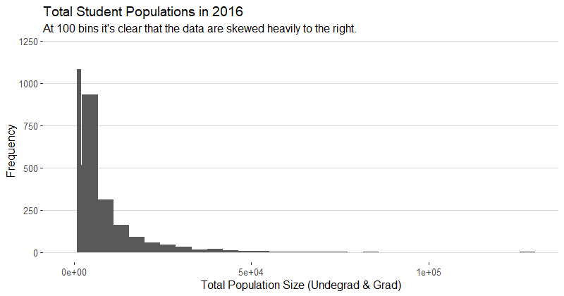
In order to get an accurate measure of total student populations for each school, I added the “size” and “grad_student” fields together, because the data dictionary defines “size” as the total population of undergrads at each school. The student populations for each year are skewed right and have a median (~450 students) and mean (~2300 students) that are quite low compared to the max value (100,000+ students). For a visual representation of the distribution of the data, please see the histogram of student populations for 2016. Since the data are skewed right, it is important to look at both the mean and the median because the median is more representative of the smaller schools with low enrollment, and the mean is representative of the larger schools. The minimum value for each year is 0, which leads me to believe that it must have been a mistake or the school had zero students in that year. Upon further review, all the colleges that had zero students enrolled are real colleges that usually have very low enrollment (East West College of Natural Medicine, American Conservatory Theater, both with 0 students enrolled). The max value for each year seems to be awfully high as well, but upon further inspection, the schools that tend to be have high enrollment are online schools like the University of Phoenix – Online Campus (205,286 enrolled) that don’t have any limitations in terms of capacity.
Overall, the 5 number summaries look similar across the years (see below), so it is safe for us to assume that student populations didn’t increase by much, judging both by the mean and the median of each year.
| Year | Summary | Year | Summary | Year | Summary | |||||
|---|---|---|---|---|---|---|---|---|---|---|
| 2012 | Min | 0 | 2013 | Min | 0 | 2014 | Min | 0 | ||
| 1st Q. | 127 | 1st Q. | 121 | 1st Q. | 116 | |||||
| Median | 452 | Median | 431 | Median | 406 | |||||
| Mean | 2377 | Mean | 2333 | Mean | 2332 | |||||
| 3rd Q. | 1992 | 3rd Q. | 1922 | 3rd Q. | 1890 | |||||
| Max | 205286 | Max | 166816 | Max | 151558 | |||||
| NA’s | 706 | NA’s | 713 | NA’s | 713 |
| Year | Summary | Year | Summary | |||
|---|---|---|---|---|---|---|
| 2015 | Min | 0 | 2016 | Min | 0 | |
| 1st Q. | 109 | 1st Q. | 109 | |||
| Median | 377 | Median | 395 | |||
| Mean | 2319 | Mean | 2424 | |||
| 3rd Q. | 1856 | 3rd Q. | 2000 | |||
| Max | 129615 | Max | 100011 | |||
| NA’s | 734 | NA’s | 728 |
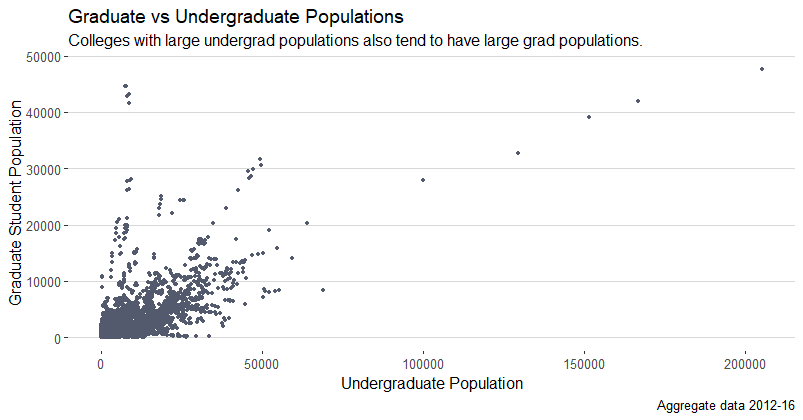
To dive a little deeper into the data, we will now explore the relationship between graduate and undergraduate populations at each school. The graph below explores the relationship between undergraduate and graduate student populations. It appears that the two measures tend to be positively correlated, or in other words, schools with higher populations of undergraduate students also tend to have higher populations of graduate students. Overall, there are about 5.5 times more undergraduates than graduate students across all schools and all 5 years 2012-2016. As expected, despite there being more undergraduate students than graduate students on average, there are some schools that are the opposite. Urshan Graduate School of Theology, Charlotte School of Law, Daoist Traditions College of Chinese Medical Arts are some of the schools that have more graduate students than undergraduate students. The trend appears to be that professional and graduate only schools have more graduate students than undergraduate.
Programs
In the dataset, each university reported the percentage of their students that are enrolled each program in the dataset (disregarding NAs). Following this logic, the percentage total for each university should be 1, or 100%, and after checking several random universities, this appears to be true. In order to get the several most and least popular programs, I added up the program_percentage columns across all universities and years. Perhaps this way of calculating the totals is not good for getting an accurate count of students enrolled in each program, but it makes sense to use it just to get the relative size or ranking of the programs by popularity within each university. The top 5 are: Health, Personal Culinary, Business Marketing, Humanities, and Visual and Performing Arts. The 5 least popular ones are: Library (Science), Military (Studies), Science/Technology, Ethnic Cultural Gender (Studies), and Architecture. When I divided the data by year and calculated the most and least popular programs for each year, the same programs were in the top 5 as in the bottom 5, and in the same order.
Tuitions
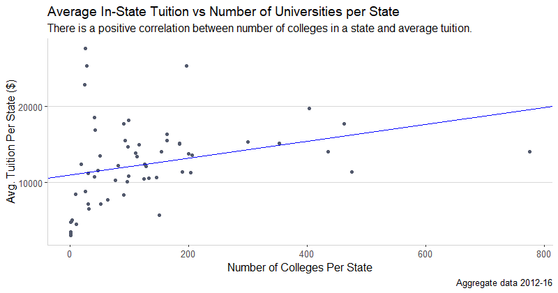
To examine the differences in tuition across states, I found the mean tuition of each state, and I graphed it against the average number of colleges per state, for the average year (2012-16). The plot below shows that there is a wide range of mean tuitions per state, averaging from around $4,000 to $27,627 for in-state tuition per year. There is also a wide range of schools per state, ranging from 1 to 780, on average across the years 2012 to 2016. I chose to take the average of all values relevant to this plot across the years because in previous section, we established that there is not a big difference in characteristics among the years. The plot below shows that states with a slightly higher number of colleges tend to have higher tuitions as well (Adjusted R^2 = 0.07). One possible explanation for this is that a state that supports more schools has more expenses as well such as the cost of infrastructure, cost of housing, cost of hiring enough professors and staff, etc. For this reason, there are higher costs associated with states that have more schools. As with any rule, some exceptions such as Rhode Island exist (upper left most point on the plot), which only has 26 schools but an average tuition of $27,627. It is possible that the schools in Rhode Island are more expensive because of the particular circumstances of Rhode Island such as most of the schools being private, less government funding for the education system, etc.
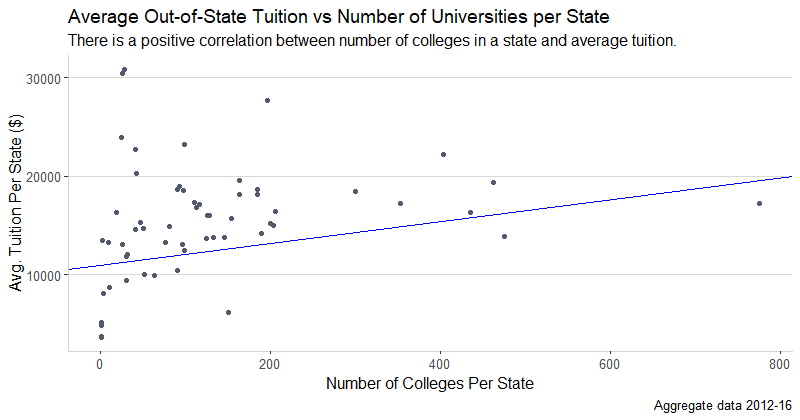
The trend for out-of-state tuition is very similar, with the same positive correlation (Adjusted R^2 = 0.05) for tuition vs. number of colleges, and the same outliers. The range of avg. out of state tuition is slightly wider at $3,610 to $30,389. But all in all, the in-state and out-of-state tuition trends are very similar.
Diversity
The question of diversity is a rather big question to analyze because there are so many ways to define and measure diversity. Many scholars have spent decades researching this topic, and I want to distinguish my work from theirs by saying that my analysis is rather rudimentary and for the sake of the length of report, simple in approach. From experience, when I hear diversity being defined, it is usually defined along racial and ethnic lines, and measured by how much each race makes up the population of each university. I will approach diversity in a similar way – by defining diverse schools as those that are made up of at least 10% each: Black, Asian, and Hispanic.
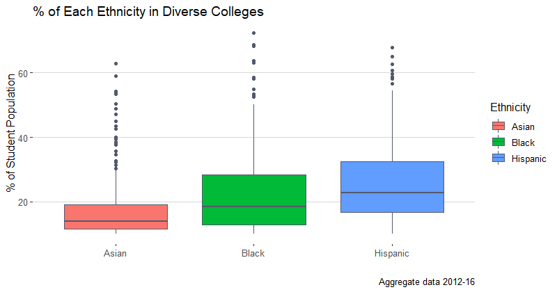
The above boxplots show the average distributions of the 3 ethnicities across all years and schools that have at least 10% of each group. The median for the Asian population is 14.88%, 18.77% for the Black population, and 24.32% for the Hispanic. The data range from 10.01% across the groups to a max value of 75%. The data for each group seems to be fairly spread out, meaning there are schools where each group is a majority of the population and the other two groups still comprise at least 10% each. The middle 50% of the data is the least spread out for the Asian group, with an IQR of only 8.73%, as compared to 13.85% for the Black population, and for 14.72% the Hispanic.
As for the specific universities that comprise this list, there are 150 in total, in 2016. 2016 has proven to be fairly similar to the other years, as we established previously. For the sake of brevity of this report, here are several examples of such colleges: College of Alameda, American Career College-Los Angeles, Bethesda University, California State University-East Bay, and Sofia University.
Solutions to the Questions from Part 1
In this section I will answer two of the questions that I asked about the data in the first part of this report. Both of the questions interested me because they could easily be used by potential future students and new graduates to get a basic understanding of the context of the decision that they are making. For more details, please see the information below.
- Is there a relationship between the highest degree awarded and median earnings 10 years after start for each university?
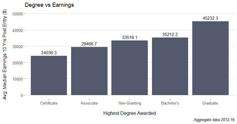
I thought asking this question could help a potential student decide what kind of college he wanted to attend in order to secure his future. To help answer this question, I took the average Median Earnings 10 years after Entry across the highest degrees each university offered. The salaries ranged from $24,036 for universities offering Certificate Degrees as their highest degree to $45,232 for universities offering a Graduate degree as their highest degree. The median for the data is right around $33,516. Of course, it is important to be aware that correlation doesn’t always equal causation, and for this reason, the potential student shouldn’t simply jump at the first opportunity to attend a university offering graduate degrees. There could be confounding variables, like the program itself, the student’s work ethic, and the student’s past academic success, etc. Despite this, the bar graph above should help the potential student, at least start his research into what colleges to apply to and give him a data-based foundation of the relationship between earnings and the highest degree offered.
- Is there a relationship between the size of the university and faculty salary?
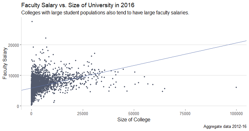
To answer this question, I will focus on the most recent year, as it contains the most up-to-date information. In the year 2016, there seems to be a positive correlation between the size of the school and monthly faculty salary. The regression line was added simply to show the positive relationship between the variables, and is not meant to be analyzed further (it may break assumptions). This graph could help students who are looking to become faculty to decide what size of school to apply to based on the salary. Despite the apparent positive relationship between the two variables, it’s important to note the cluster of colleges in the lower right corner of the graph that seem to be the exceptions. They are some of the largest colleges, but have relatively low faculty salaries. On the other hand, in the upper left hand corner, there are a few colleges that have some of the highest faculty salaries but are quite small in size.
The average monthly faculty salaries range from $216 (perhaps a stipend) to $27,570. The range for the size of the colleges ranges from 0 (small private trade schools) to 100,011. As mentioned above, despite the positive relationship between school size and faculty salary, correlation is not always causation, and select faculty may make more money at a smaller school. This graph is only meant to be a starting point for further research.
The above two questions showed some interesting results and confirmed my existing suspicions. It seems fair that students who attend a school with a higher degree than other schools will also earn more money later on. It also seems correct that bigger schools will pay their faculty more because there is more to do, and perhaps more money for the school to spend. As mentioned several times, these graphs that attempt to answer the questions I posed only show correlation, as it is very hard to show causation in an observational study. Correlations are not meaningless however, and they can be great starting points for further exploration, as was my intention.
Additional Questions
- Across all years, what does the gender distribution look like for the universities in the dataset?
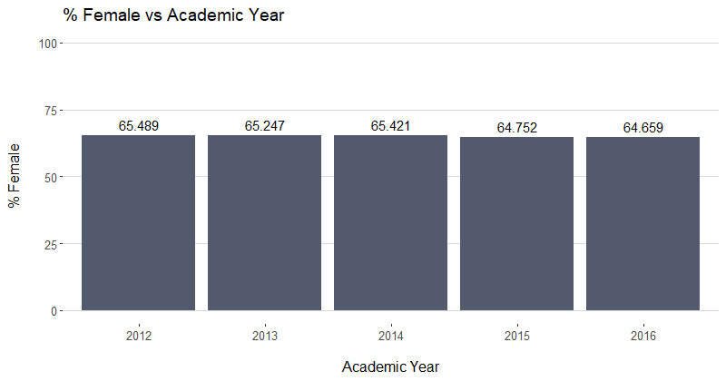
I wanted to explore this question because I was wondering what kind of diversity there was in terms of gender across universities. From this graph, it looks like the percent of females is right around 65% across all school across all years. While this is a simple graph, it accurately portrays percentage as the y-axis. There also don’t appear to be any changes in the number, nor any spikes or valleys worth exploring.
- Is there a difference in median earnings 10 years after entry for predominantly female (65%+) vs predominantly male (65%+) schools?
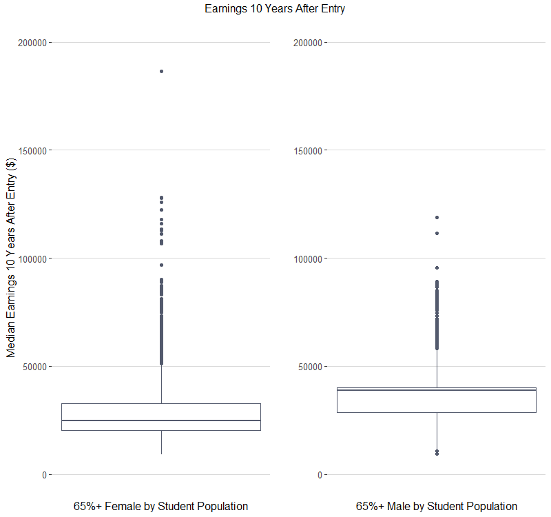
From these two boxplots, comparing the median salaries for colleges that are at least 65% male vs female in size, it looks males have a higher median salary ($38,800 vs $24,800), but the females have a higher maximum value ($186,500 compared to the men’s’ $118,900). The spread looks similar, with the females having a little greater range from $9,100 to $186,500 compared to the men’s $9,500 to $118,900.
Analysis and Code
In this section, I include the code that I used to create the visualizations seen in the report.
Graduate vs Undergraduate Populations
library(ggplot2)
library(ggthemes) # Cool themes

ggplot(card, aes(x = size, y = grad_students)) +
  geom_point(color = "#535a6d", size = 1) +
  labs(
    x = "Undergraduate Population",
    y = "Graduate Student Population",
    title = "Graduate vs Undergraduate Populations",
    subtitle = "Colleges with large undergrad populations also tend to have large grad populations.",
    caption = "Aggregate data 2012-16"
  ) +
  theme_hc()+
  # adding y-axis
  theme(axis.line.y = element_line(color="light gray", size = .25))
In-State Tuition vs Number of Colleges
# Making a data frame of the average in-state tuition per state
tuition_agg1 = aggregate(card$tuition.in_state, by=list(card$state), data = card, mean, na.rm = TRUE)
tuition_agg1 = as.data.frame(tuition_agg1)


# Getting the avg. count of colleges per state per year (avg. of years 2012-16)
x_axis1 = round(as.numeric(as.character(unlist(as.data.frame(table(card$state))["Freq"])))/5)


# Adding the counts to the tuition df; changing colname to "tuition"
tuition_agg1$x_axis = x_axis1
colnames(tuition_agg1)[colnames(tuition_agg1) == "x"] = "tuition"


# Plotting a scatterplot with a regression line to show direction of correlation only
# Assumptions are not met to regress the data
ggplot(data = tuition_agg1, aes(x = x_axis1, y = tuition)) +
  geom_point(color = "#535a6d", size = 1.5) +
  labs(x = "Number of Colleges Per State",
       y = "Avg. Tuition Per State ($)",
       title = "Average In-State Tuition vs Number of Universities per State",
       subtitle = "There is a positive correlation between number of colleges in a state and average tuition.",
       caption = "Aggregate data 2012-16")+
  theme(axis.line.x = element_line(color="light gray", size = .25),
        axis.line.y = element_line(color="light gray", size = .25))+
  theme_hc()+
  geom_abline(slope = 11.07, intercept = 10991.14, color = "#5d73af")

# To get the slope and intercept above
lm(tuition_agg1$tuition~x_axis1)

# Out of state tuition is done in a directly analogous way.
Diversity Boxplots
library(dplyr)
library(reshape2)


# Filtering the original "card" dataset to only include diverse schools
# Selecting only the school id, academic year, and the ethnicity columns
card_box = card %>%
  filter(demographics.race_ethnicity.black > 0.10 &
         demographics.race_ethnicity.asian > 0.10 &
         demographics.race_ethnicity.hispanic > 0.10) %>%
  select(id, academic_year,
         demographics.race_ethnicity.black,
         demographics.race_ethnicity.asian,
         demographics.race_ethnicity.hispanic)


# Melting the data into a ggplot2-friendly format (tidy data)
card_box_melt = melt(card_box, id = c("id", "academic_year"))


# Calculating the average ethnicity value for each college across the years
card_box_melt = card_box_melt %>%
  group_by(id, variable)%>%
  summarize(value = mean(value))


# Graphing the boxplots
ggplot(card_box_melt, aes(y = 100*value, x = variable)) +
  geom_boxplot(color = "#535a6d", aes(fill=variable)) +
  labs(x = "",
       y = "% of Student Population",
       title = "% of Each Ethnicity in Diverse Colleges",
       caption = "Aggregate data 2012-16") +
  theme_hc()+
  theme(legend.position = "right") +
  scale_fill_discrete(name = "Ethnicity",
                      # Changing the order to be alphabetical
                      breaks = c("demographics.race_ethnicity.asian",
                                 "demographics.race_ethnicity.black",
                                 "demographics.race_ethnicity.hispanic"),
                      # Renaming the legend
                      labels = c("Asian", "Black", "Hispanic")) +
  # Renaming each plot
  scale_x_discrete(labels = c("Asian", "Black", "Hispanic"))
Highest Awarded Degree vs Earnings
# Making a subset of the full "card" dataset to just show highest degree
# and the average of the "earn_10_yrs_after_entry.median" for colleges with
# each respective highest degree
degree = as.data.frame(aggregate(card$earn_10_yrs_after_entry.median,
                                 by=list(card$degrees_awarded.highest),
                                 data = card, mean, na.rm = TRUE))
The resulting data frame is shown below. “Group.1” is the highest degree awarded, and “x” is the average of the median earnings 10 years after entry for all colleges across all years within each group of highest degree awarded.
| Group.1 | x |
|---|---|
| Associate degree | 29466.71 |
| Bachelor’s degree | 35212.20 |
| Certificate degree | 24036.35 |
| Graduate degree | 45232.35 |
| Non-degree-granting | 33516.12 |
# Graphing the plot above
ggplot(degree, aes(x = reorder(Group.1, x), y = x)) +
  geom_bar(stat="identity", fill="#535a6d") +
  labs(
    x = "Highest Degree Awarded",
    y = "Avg. Median Earnings 10 Yrs Post Entry ($)",
    title = "Degree vs Earnings",
    caption = "Aggregate data 2012-16")+
  theme_hc() +
  # Giving the title some breathing room
  theme(axis.title.x = element_text(margin = unit(c(5, 0, 0, 0), "mm")),
        axis.title.y = element_text(margin = unit(c(0, 5, 0, 0), "mm")))+
  # Remaning the bars
  scale_x_discrete(labels = c("Certificate", "Associate",
                              "Non-Granting", "Bachelor's", "Graduate")) +
  # Adding the earnings on top of each bar
  geom_text(aes(label=round(x,1)), vjust = -0.5) +
  ylim(c(NA, 50000))
Predominantly Male vs Female Colleges
# Defining colleges of interest
women = card[card$demographics.women  > .65,]
men = card[card$demographics.men  > .65,]

require(scales) # Allows the use of full numbers instead of scientific notation

women1 = ggplot(women, aes(y = earn_10_yrs_after_entry.median)) +
  geom_boxplot(color = "#535a6d") +
  ylab("Median Earnings 10 Years After Entry ($)") +
  xlab("65%+ Female by Student Population")+
  theme_hc()+
  theme(axis.text.x = element_blank(),axis.ticks.x=element_blank())  +
  ylim(c(0,200000))

men1 = ggplot(men, aes(y = earn_10_yrs_after_entry.median)) +
  geom_boxplot(color = "#535a6d") + ylab("") +
  xlab("65%+ Male by Student Population")+
  theme_hc()+
  theme(axis.text.x = element_blank(),axis.ticks.x=element_blank()) +
  ylim(c(0,200000))

# Putting the plots next to each other using gridExtra
library(gridExtra)

grid.arrange(women1, men1, ncol = 2, top = "Earnings 10 Years After Entry")