
Scraped Car Price Data Exploration
Overview
I analyze a wide variety of data from a car sales website.
Data
Data overview
I’m using car ad data that I scraped online. Geographically the data covers most of the continental United States and contains the most popular car manufacturers such as Toyota, Honda, Audi, Ford, as well as others. The data I gathered consists of ads available in the Winter of 2020 and contains features such as the make, model, engine type, mpg city, mpg highway, as well as many others. More detailed exploration of the data follows in the sections below.
Duplicates
In total, the data consists of over 50,000 data points. Judging by the Ad ID, there are a lot of duplicate ads, which is expected as my search areas overlapped during the scraping process. Judging by the VIN, there are not so many different ads for the same car, though. After keeping only the first of duplicate ads and the first of duplicate cars, I ended up with just under 36,000 unique car postings.
Missing data
The subModel feature had 35,893 missing values, and the badge feature had 5,082 missing values. Because there was no information that I was likely to gather from mostly missing columns, I deleted the subModel feature. For reference subModel of a car is a way of specifiying the car beyond just make and model; thus - subModel.
Because the badge variable is based on the other variables, I will remove it as well to avoid multicollinearity issues later on.
Exploratory Data Analysis
Where are the cars?
The map visualization above shows circles, corresponding to the locations of cars sold as well as amount of cars sold (by the size of the circle). Also the states colored a darker shade of blue are states where relatively more cars were sold.
A few interesting patterns emerge from this viz. The first is that a lot of cars are sold in California and Texas. In these states there are big hubs of activity centered around the large cities such as San Francisco, Los Angeles, and Dallas. Interestingly, outside of those hubs, there is not too much activity. On the East Coast on the other hand, it appears as though the hubs aren’t as large, and the activity is spread out more evenly across smaller communities. This is shown by the fact that on the East coast, broadly speaking, the dots are smaller but more spread out, whereas on the West Coast, the dots are closer together and larger in size.
In this report, there aren’t ads that come from North Dakota, South Dakota, or Nebraska.
Given this broad overview of the data, I will dive into the deeper analysis, shown below.
The main takeaway I have from the above visualization is that the data are not equally distributed among the different dimensions, meaning for example there are more Kias than Nissans. This means that down the line, I will have to pay closer attention to models that perform well only when data is equally distributed, such as linear based models, for example.
Prices for each region
This visualization makes it clear that the highest median price for a car is in the North-West (as delaminated on the map above) and the lowest in the South-West. The range of values is not too great, however. The minimum is 23,900 USD and the maximum is 25,881 USD. It’s important to note, however, the differences in the number of car listings in each region. This may play a role in skewing the data slightly. But, as mentioned before, it’s clear that the differences between the median prices of cars in each region are not great, so I doubt this will play a role in modeling.
Corrlation plot pre-cleaning
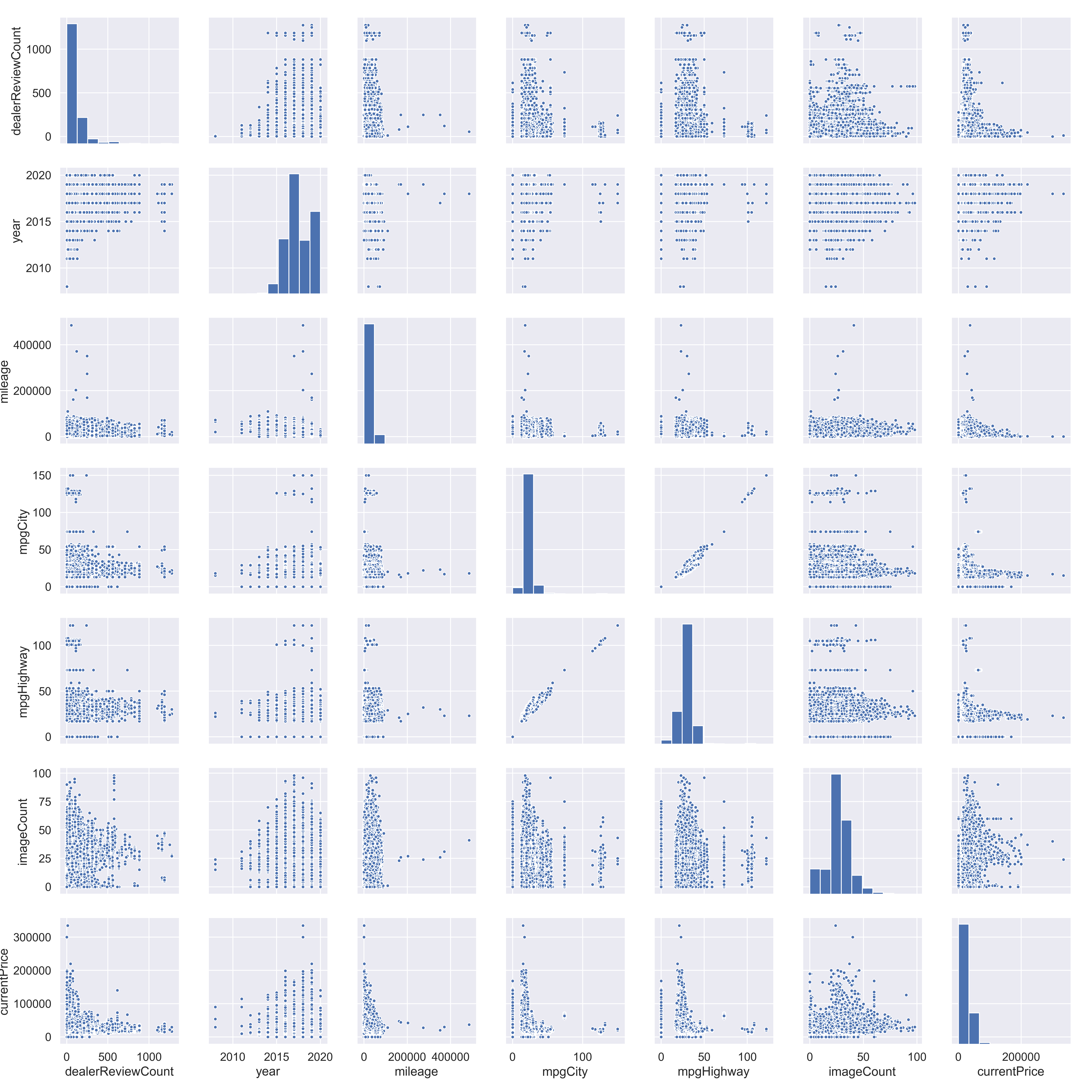
This plot is very large and overwhelming, but I’m only really looking for multicollinearity between features that may mess up a lot of future modeling. There looks to be a high correlation between mpdCity and mpgHighway, something that I will have to account for in the future. It’s possible that keeping just one will yield better results.
A few other things stand out too. For example There is a cluster of cars on the high end of mgpCity and mpgHighway. These are likely hybrid cars that will have to be accounted for, as they are outliers. Analogously, there are cars that have 0 mgpCity and 0 mpgHighway readings. At first glance, these are likely electric cars, but I will doublecheck.
Mileage, currentPrice, and dealerReviewCount also have pretty heavy outliers that may need to be accounted for.
There are 813 cars that have mpgCity and mpgHighway listed as 0. Some of them are not electric which implies that the zeros were put in by mistake. To remedy this, I will check the data for any other cars of the same make, bodytype, model, and year to see if there are any of the same cars with mpgCity input. If there are, I will use that value. If not, I will look in other years and finally in other models. Ultimately if there aren’t any analogous cars, I will impute the values myself. Luckily I only had to input 10 or so values myself.
Below is a code snippet that may better explain my process for imputing the wrong mpg values.
# Imputing missing mileage through looking at other similar cars
manually_add_mpg = []

for index, row in tqdm(no_mpg_gas.iterrows()): # tqdm() is a package that shows a progress bar for iterations
    # Looking for other cars that have an mpg reading
    x1 = data[(data['make'] == row['make']) & (data['bodytype'] == row['bodytype']) &
            (data['model'] == row['model']) & (data['year'] == row['year']) & (data['mpgCity'] != 0)]
    # broadening the search to not include year
    x2 = data[(data['make'] == row['make']) & (data['bodytype'] == row['bodytype']) &
            (data['model'] == row['model']) &(data['mpgCity'] != 0)]
    # broadening the search to not include model
    x3 = data[(data['make'] == row['make']) & (data['bodytype'] == row['bodytype']) &
            (data['mpgCity'] != 0)]
    # at this point, manual input is required

    # Checking the above conditions and imputing if met
    if len(x1) != 0:
        data.at[index,'mpgHighway'] = x1.iloc[0,]['mpgHighway']
        data.at[index,'mpgCity'] = x1.iloc[0,]['mpgCity']

    elif len(x2) != 0:
        data.at[index,'mpgHighway'] = x2.iloc[0,]['mpgHighway']
        data.at[index,'mpgCity'] = x2.iloc[0,]['mpgCity']

    elif len(x3) != 0:
        data.at[index,'mpgHighway'] = x3.iloc[0,]['mpgHighway']
        data.at[index,'mpgCity'] = x3.iloc[0,]['mpgCity']

    # if not met, adding to a list to be imputed manually
    else:
        manually_add_mpg.append(row)
CurrentPrice == 0
There are also 272 cars in the data where their currentPrice is zero. This is problematic because currentPrice is the target variable. Normally I would impute this, but given that it’s a target variable, using ML to impute the value and the using the imputed value as a target might introduce a lot of variability. To avoid this, I will remove them. I will later use them to test the frontend of my web app that predicts these prices.
Obvious outliers
There are ten cars that have a mileage of over 150,000 miles and a price of over $201,000. These cars are by nature influential and may harm my models because the bulk of the data is well inside of this range. For this reason, I will remove them. I feel comfortable doing this because there are only 10 data points here and they are not useful in predicting cars at a much lower price range, such as $20,000.
Removing Small Cells
In this section, I remove some of the smallest cells in the data. By this I mean, any grouping or combination of groups that doesn’t have many members. The reason for doing this is that small cell sizes tend to have a negative effect on a model’s predictive abilities. As a rule of thumb, I will keep only the groups in which there are more than a dozen (12) members.
Correlation plot post-cleaning
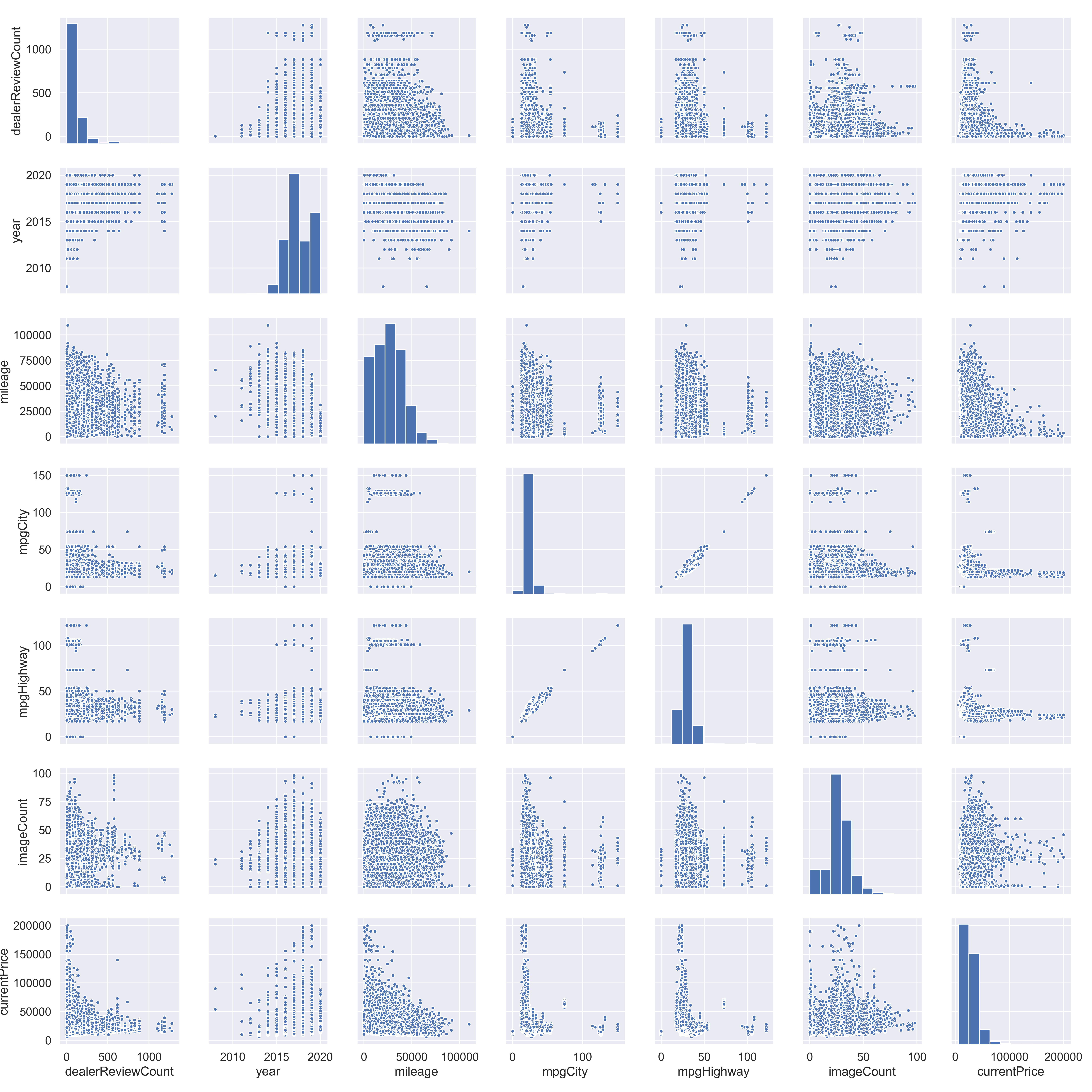
Now with the big influential points removed, it’s easier to look at the trends between the numeric variables. To start, there are some visible clusters of cars that may be easy to explain. For example mpgCity and mpgHighway have high end clusters, likely as a result of hybrid cars. There are also some cars from the year 2008, which might be influential. there also appears to be a cluster of dealerships with a very high amount of reviews, likely as a result of them being very good or very bad.
Some other patterns stand out too. For example as mileage goes up, currentPrice seems to go down exponentially, somewhat expectedly. Note that there is a wide variation of prices at low mileages, but at high mileages, prices are exclusively low.
The other variables don’t show very high correlations between each other and the target variable. This will be further investigated below with the same correlation plot, but one that better shows the correlations.
Suspicious dealerships
All the dealers with over 1000 reviews seem to only have a 5 star rating. They must be very good, have programs that incentivize giving them a 5 star review, like a rebate or discount, or are faking their reviews.
After a review of a sample of these dealerships, the reviews seemed genuine and the dealerships seemed to simply provide good service to their customers. It’s also possible that they asked for reviews and had rebates, but that is unconfirmed.
Correlation plot showing corr. coefficients
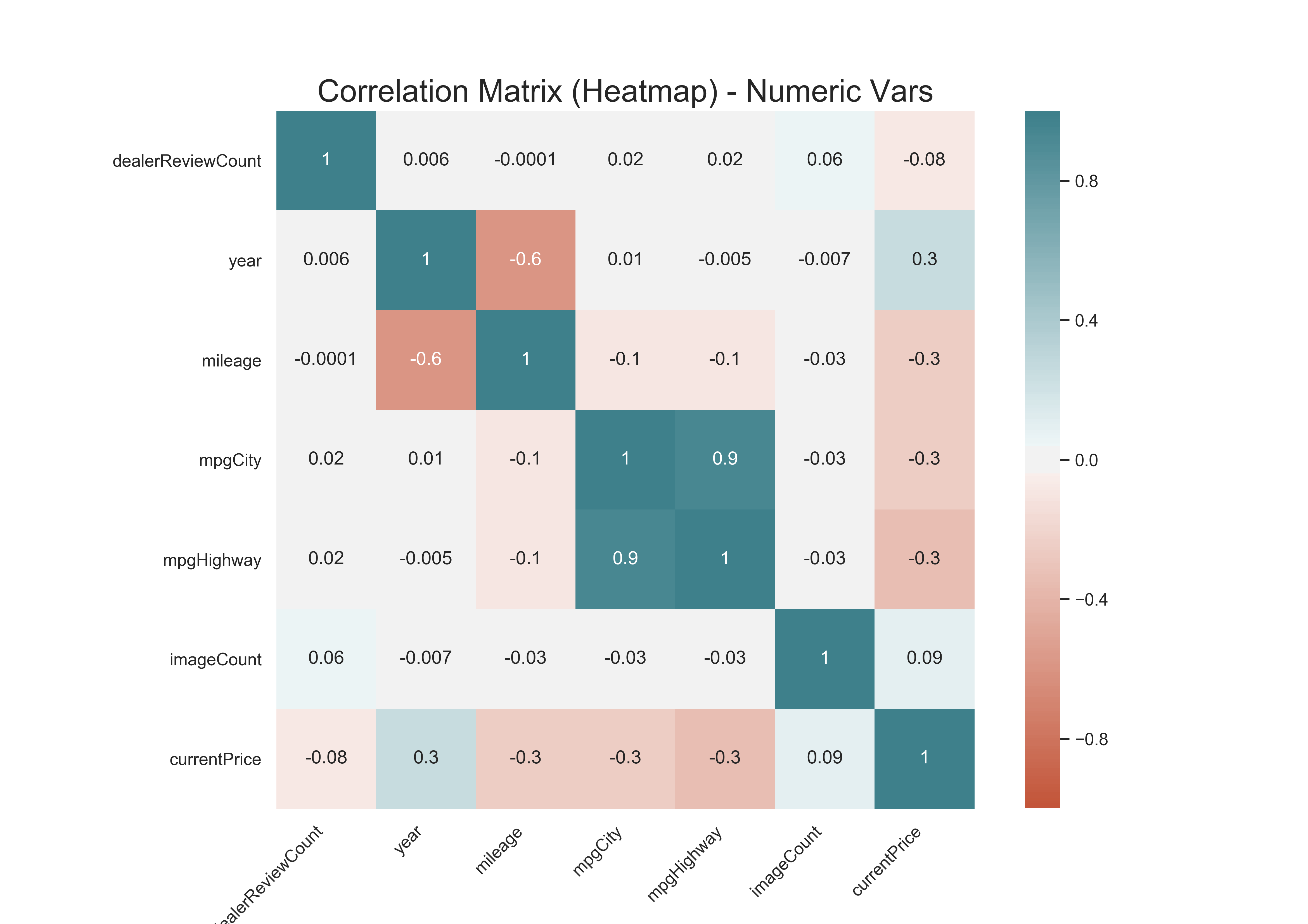
The graph above confirms some of the patterns that emerged from the correlation matrix. mpgCity and mpgHighway have a correlation coefficient of 0.9 which can be devastating for some modeling techniques such as linear regression. Year and mileage are negatively correlated at -0.6, as expected. All other correlations are fairly small and are unlikely to cause trouble in modeling. There is also a relatively high positive correlation between year and currentPrice of 0.2, which makes sense, as newer cars would cost more.